Will your readers remember your entrepreneurial business and your message? Words alone aren’t enough.
Images make a mental picture in a person’s mind, helping people remember information double as easily. Images also add an interesting visual element to your communications, to make your audience comfortable and your website less stiff and boring.
But, to get the right benefits, it’s important to use pictures well, so that they reinforce your message.
When you mix pictures and words together skillfully, your story will attract a more clients, keep people engaged for longer, and help your audience remember your brand.
Connect the content with the image
Even though some people like to use images that contrast with their content to intrigue their audience, this tactic is tricky and I don’t recommend it. A message that contrasts against an image can confuse people and doesn’t help anyone remember the content more. Just keep it simple!
The best way to use a picture is to match its image with your main point. Pictures are less effective if they represent larger, more complex information than if you use them to compliment simple ideas. So, use a picture to emphasize your headline’s main idea, which is simple.
You should also set an emotional tone with your picture. This will give your writing more personality and draw the reader in. For example, if your headline is “How to Dance Yourself Happy” a simple picture of a smiling dancer would be a great choice.
What your image should look like:
Since your image should be simple, each part of it matters. Let your image do your advertising work for you by following these easy guidelines
- Use a picture with only one subject. The more you have happening in your picture, the more confusing and distracting it will be. Make the subject clear and relate it well to your content. This will make your brand more authentic and enticing too.
- Use a simple image. Abstract images are less effective and less memorable.
- Crop your image. This is a great way to get one subject out of a busy picture. Crop your image closer than you might think, so that its main subject is the only focus of the picture.
- Keep all images consistent. Even though your images may have different colors and emotional tones, they should all be cropped and displayed in the same way. Remember, consistency makes for a trustworthy business brand.
Where to place your image
Keep your page clean and easy to read by organizing your page into invisible columns. Then you can add a picture on the right or left side of your text, narrowing the words to one column. Your pictures should follow the same lines as the rest of your website, by staying within the margins of the text.
You can also draw more attention to your text by arranging the lines of the image so that they face your information. For example, if your picture is of an animal, its eyes should be looking at the text. If your picture has a vantage point that is to the right, place this image on the left, so your viewer’s eye is drawn toward the text, as shown above. You can easily flip your images on Photoshop or even Microsoft office if you need to.
Use images sparingly
Don’t overuse pictures and images. A clean, simple design goes a long way. Simplicity keeps people focused on your content for longer.
If you do need to make an important point with pictures, remember that they are most effectively used to excite an emotional response. Also, a larger image will draw more attention to itself.
To send a message to your audience, we recommend using a large, short headline. Your content and your text should send the message. Use pictures as support for this message.
Resources
There are countless stock photo sites online. Many have a mix of free and paid images. You can peruse them by Googling “stock photo” and checking out the images they offer. These are just a few of the most common stock photo sites. Since they are more widely used, they generally have more images to choose from:
- Flickr.com: A free stock photo site. Be sure to go to the advanced “explore” option and choose “Creative Commons” if you want pictures that can be used commercially.
- Compfight.com: A site that makes searching for Creative Commons images easier. It finds all Creative Commons images from the web in one place.
- Istockphoto.com: A site that allows you to buy credits, which you use toward photo purchases. The prices are reasonable and all images can be used for commercial purposes.
Examples

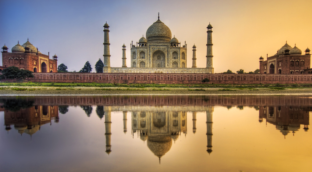
Remember the last hotel you walked into? Its foyer was probably adorned with a pastoral scene. That’s because pictures of abundant nature (with lakes, and lush vegetation) are comforting to people. They make us feel like we are safe and will be able to “live off the land” easily.

On this cropped magazine cover by The Economist, the text creates the most interest. The picture of the lion is clear, simple, and facing the text. However, the main message is obvious because it is written out in a large, short headline.